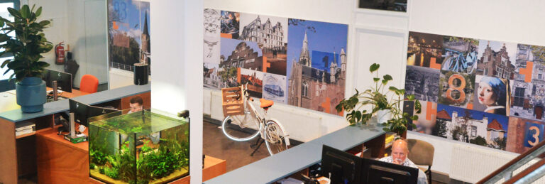
Revitalization of interior and corporate identity RBVK and a new website. RBVK is a company with ambition and still growing. They would like to show this to the outside world and position themselves more strongly. The wish was therefore to strengthen all communication while maintaining the logo and providing the corporate identity with a fresh update. This has been translated into a new website, a new interior with photo walls and new colors.
Concept with a meaning. When you think of RBVK, you think of the involvement of entrepreneurial Delft and the surrounding area. These two things are characteristic of the visual language and therefore play the leading role in the renewed house style. The photographic image concept of the artworks represents the connection with all clients and the powerful history of RBVK. A exible basic grid, built from square ‘tiles’, ensures unity in the visual language. This provides frameworks and freedom. The basis of this project is the color palette of “Vermeer”. This was then translated into the interior and the visual language of the new RBVK website. An environment that is completely contemporary again.
For more info: www.rbvk.nl